Date: November 2022 The verification has been carried out with the following versions of the application:
- Android: version 1.0.2 last updated on August 10, 2019 (requires android 5.0 or higher).
- iOS: 2.1.3 last updated on June 16, 2020 (requires iOS 13.0 or later).
What devices have been used for testing?
The tests on Android have been carried out with a Xiaomi Redmi Note pro 9 terminal (MIUI global 12.5.8). The tests on iOS have been carried out with an iPhone 6S terminal (iOS 14.4)
User interface and functionalities
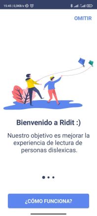
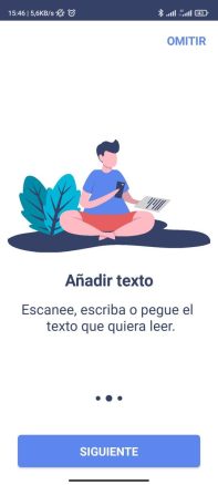
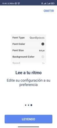
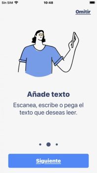
When opening the application for the first time after its installation, we find three infographics that present the basic functionalities as illustrated below:
On Android:
On iOS:


After going through the introduction we are presented with the following menu, very similar between the iOS and Android versions. The only significant difference in the menu is that the android version allows you to activate or deactivate the reading aloud of the text that you decide to focus on. As you can see, there are 4 main elements; voice reading, settings, scanning and writing text.
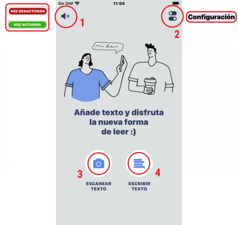
- Turn voice on/off (only available on iOS):By pressing this icon located in the upper left part of the screen, we can make the application include a narration of the words of the text that the application processes, only those that we focus on, not to be confused with a screen reader.
- Configuration:This small icon located in the upper right part of the screen, allows us to access the customization of the following settings:
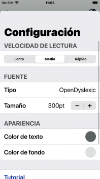 – Reading speed: in both iOS and Android there are 3 speed options.- Font: in both iOS and Android, the options are Arial, Verdana and OpenDyslexic (by default).- Font size: more are allowed in iOS customization than in android since it allows you to manually adjust the sizes in a greater range, in android there are only 3 default options.- Appearance: allows you to choose the text and background colors from a preset selection of colors, it does not allow a high contrast since the The background options are pastel tones, it could be improved by leaving the choice of colors free for people with low vision.- Tutorial and credits: in this final section we can reactivate the initial infographics and see the credits to the developers and collaborators.
- Scan text:This functionality that we access from the icon in the lower left part consists of 3 parts, the capture of the text through the mobile camera, the text editor and the player of the sequence of words.
Capture text:
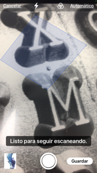
The operation in iOS is as follows: the mobile camera opens and when taking a photo you can crop the part of the text of the image on which we want to focus, we can discard the photo and repeat it or keep it and go on to take more photos, by end all recognized text will be added below
On Android, the difference is that photos cannot be taken in landscape format as text is not recognized. It also does not allow you to drag the corners or take more than one photo consecutively.
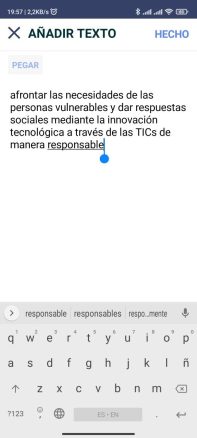
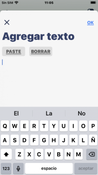
After capturing the text, on this screen we find a text editor (Android left, iOS right). In this editor we can see the words captured with the default font that our system has, not the one that we have previously selected in the menu.
We can edit, quickly paste text or simply manipulate the text that we want it to process in the player in the last step. iOS offers little extra options.
Playing text:
In iOS it is allowed to access directly through Siri shortcuts as you can see below.

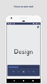
At the end of the sequence of words, which we have found to be a bit more chaotic on Android, the application allows you to start playback from the beginning or exit to the main menu. On iOS, previously scanned/edited text is kept until you edit it again, whereas on Android, it is cleared each time you start the text scan/editor again.
Write text:This functionality is identical to the previous one except for the text capture part by photo, the process starts from the text editor and ends when the text is reproduced with the chosen font. The icon is located at the bottom right.
User Experience
During the technical verification tests, we have detected that the Android application, in general, has fewer options and is less usable. Less configuration margin, less usability and effectiveness of text scanning, etc... In iOS, the application does look more polished, although it still has room for improvement. We really appreciate that this app can be a small complement for certain people, especially considering the difficulties that some terminals pose to change the system fonts. But overall, we believe that with small changes (which may come with new versions), the app will actually be more usable, smooth, and more useful for even more people. In a normal flow of use of the application, we have realized that it can lead to a little frustration or that it is not always possible to take advantage of the potential of the application, mainly on Android. Two very illustrative examples of this are;
- On android especially, the image preview shown is not what the app finally gets as it significantly crops the margins (the app doesn't give you any visual guidance) along with the constrained cropping constraints and also the one that doesn't show up. can extract text with a horizontal photo, it can be disruptive and lead to many failed attempts even knowing that this happens beforehand.
- In the text editor, after capturing the image, this text is not displayed with the friendly font that the application lets you select. Even considering that it can be positive that the words are shown in a (more or less consistent) sequence of words afterwards, it is reasonable to think that the person who tries to focus on improving their perception of said text, does not want the block of text to bother them. make it easier to edit and read in the previous steps, this also applies to the rest of the text in the menus, etc... Therefore, it seems to us that the application could be significantly improved if it took more into account the groups of people to whom it is directed and even if it includes with minimal effort some extra accessibility features like high contrast (at least in the player).
External evaluations: The external evaluations extracted from the comments from the places where the applications are downloaded, as well as from mentions on social networks, are generally more or less aligned with the fact that the application is very positive but that it has a lot of room for improvement. The vast majority mention the benefits of the application being able to change the font and size of the text for better understanding and make clear the need that people have in this area, as well as the lack of simple, accessible and usable options.
Technical performance
Reliability: During the testing period, the applications did not present any unexpected shutdown, performance or interface failures or unwanted operation. Consumption: Battery consumption is minimal on both operating systems. Versatility and compatibility: The Ridit app can be installed on a wide variety of iOS and Android devices as the minimum requirements are very low. Security and privacy: The application's privacy policy can be found at the following link: https://martupuri.github.io/ridit_policy/
Accessibility
Ridit has a clearly inclusive objective and a functionality aimed at facilitating access to reading text for people with visual difficulties or dyslexia. This is especially relevant given that the different mobile terminals often make it difficult to change to a personalized font. However, in Android there is less room for configuration such as the size of the text through 3 categories instead of the selector in iOS. In general, in both operating systems the accessibility is not as high as could be expected, mainly because the font chosen in the configuration is not applied to the rest of the interface, only to the player (menus and text editor could benefit a lot), the colors to customize the interface do not offer high contrast options or the fact that some icons are small and hardly recognizable in some cases. In addition, words in the player are sometimes displayed in inconsistent sequences that can make reading difficult (many words at once in small font vs. few very large words, inconsistencies in the presentation of two words belonging to two different phrases, etc.) …).
Conclusions
Currently there are few dyslexia support products that are accessible and usable, mainly on mobile devices, on web platforms (through extensions) or on computers (through system font customization) in conjunction with other tools such as visual settings , narrators, screen readers, etc. is where the efforts have been focused so far. Ridit offers a positive contribution to facilitate the reading of text for people with dyslexia although it could be much more. We like the application but we don't know much about it, it has a lot of potential that we hope will be developed in the future. To better synthesize the information in this review, we include below highlights and points for improvement. Highlights
- Simplicity: The application is direct and focuses on a few well-identified functionalities, visually simple, which facilitates the flow of normal use.
- iOS and Android version: it does not exclude any of the most widely used mobile operating systems.
- makes reading easier, through the functionalities, is the main objective of the app according to the developers.
- Allows some configuration to adapt a little to the needs and preferences of each person.
- Siri shortcut: it's a big plus point that it integrates so well with the virtual assistant on iOS Siri.
Improvement points
- Interface: The configuration icon can certainly be small or not very intuitive, normally users associate other icons with the configuration. In addition, we have missed that the font chosen in the configuration was applied to all the text (menu, editor, etc.) of the application from that moment on and also the size could also be applied in the text editor to facilitate the use and understanding also on that screen.
- Limited configuration options: the color palette is quite restricted, the speeds could leave more room for configuration as is already offered with the size of the font in iOS.
- Differences between iOS/Android versions: some differences are more subtle (interface) and others quite noticeable (functionality).
- Text scan: usability and functionality can be improved (upload photo from gallery, monopolize iOS and Android, etc…).
- Text reproduction: the consistency of the sequence and the separation of fragments of the text can be improved to give a better experience.