Author: Billy Avellán Salazar.
Date: November 2021.
As we have said before, in some cases the interaction with mobile devices can be difficult, either due to understanding the environment, the size of the letters or access to the functionalities.
Therefore, this type of application is a good solution to these problems.
In this case, Senior Safety Phone offers us a more friendly and intuitive interface that allows a better visualization of the contents, in addition to this, it is capable of being configured, since we can modify certain aspects to have a faster and easier access to the functionalities we need.
Interaction.
We will proceed to a more in-depth analysis.
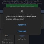
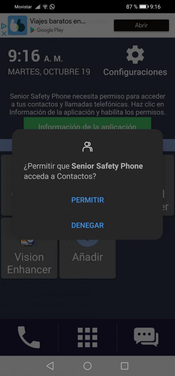
When opening the application, it will request permission to access the user's contacts as we see below:

This will be the only permission you request since, if you use the rest of the features such as access to the gallery or the camera, it will be done through the mobile launcher itself.
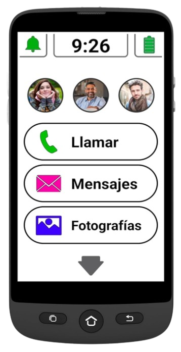
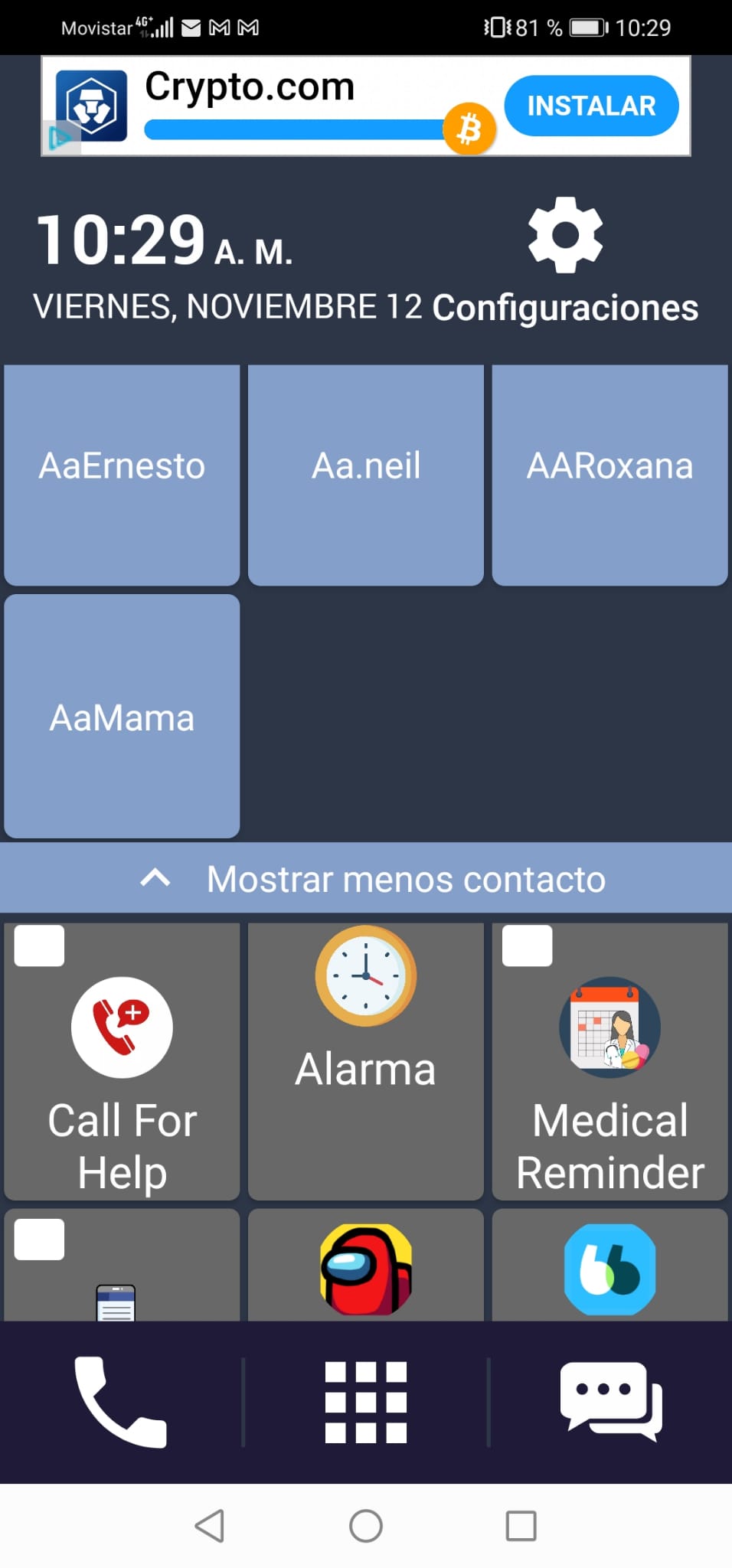
After this, a message will appear advising us to use the app as the default launcher, and after adjusting it, we will go to the main page shown in the following image:

As we can see, the icons and letters have a size that makes them easily recognizable.
In addition to the fact that the environment is quite intuitive at first glance, we can highlight the following:
– At the top of the screen we see that the notification bar does not change, keeping the one of the device itself, however, going down a bit we see how the interface design changes completely.
– In the first half of what we could call the screen corresponding to the app we observe that:
- Both the time and the date of the corresponding day are quite noticeable.
- Access to the device configuration is quite visible and simple, since we only need to press the icon, without having to scroll through different pages.
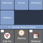
- We can assign a part of the screen to our main contacts, allowing contact with them, through calls, to be instantly and easily.
– In the second half we have the following:
- A section dedicated to the applications that we use the most, being able to add and remove the ones we want. In this section we highlight, again, that the size, both of the letter and of the images, makes those applications that we want to access or place highly visible.
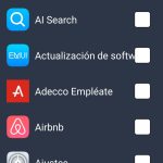
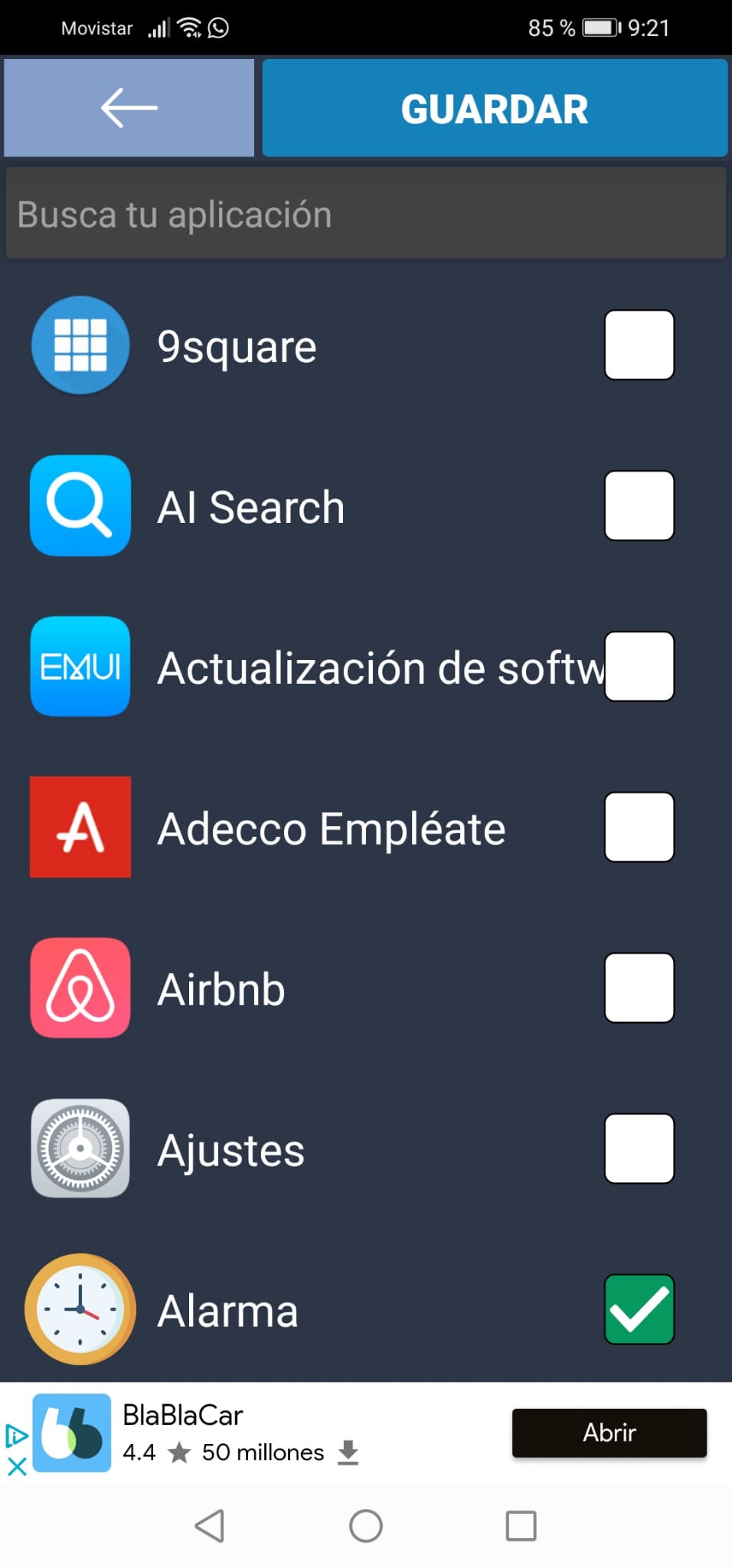
- If we want to add apps to the main screen, we can find them through a search engine, which will allow us to put the name of the app in question, thus facilitating the configuration of the screen.
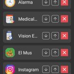
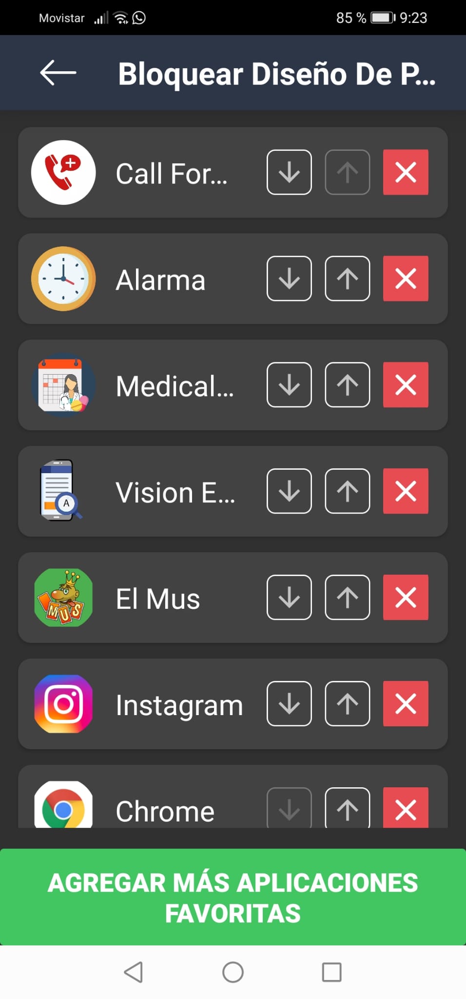
- For more convenience, once the applications have been chosen, we will be allowed to place them in the order we want, add some more, or if we have made a mistake when choosing, we can easily remove them from the list.
- All this prevents the interface configuration from becoming so heavy and allows modifying these aspects described to make the interaction with the device more user-friendly.


- The lower part of the screen, where we can access:
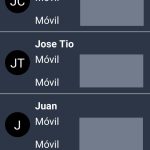
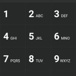
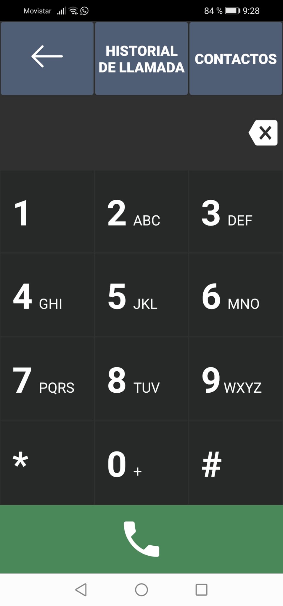
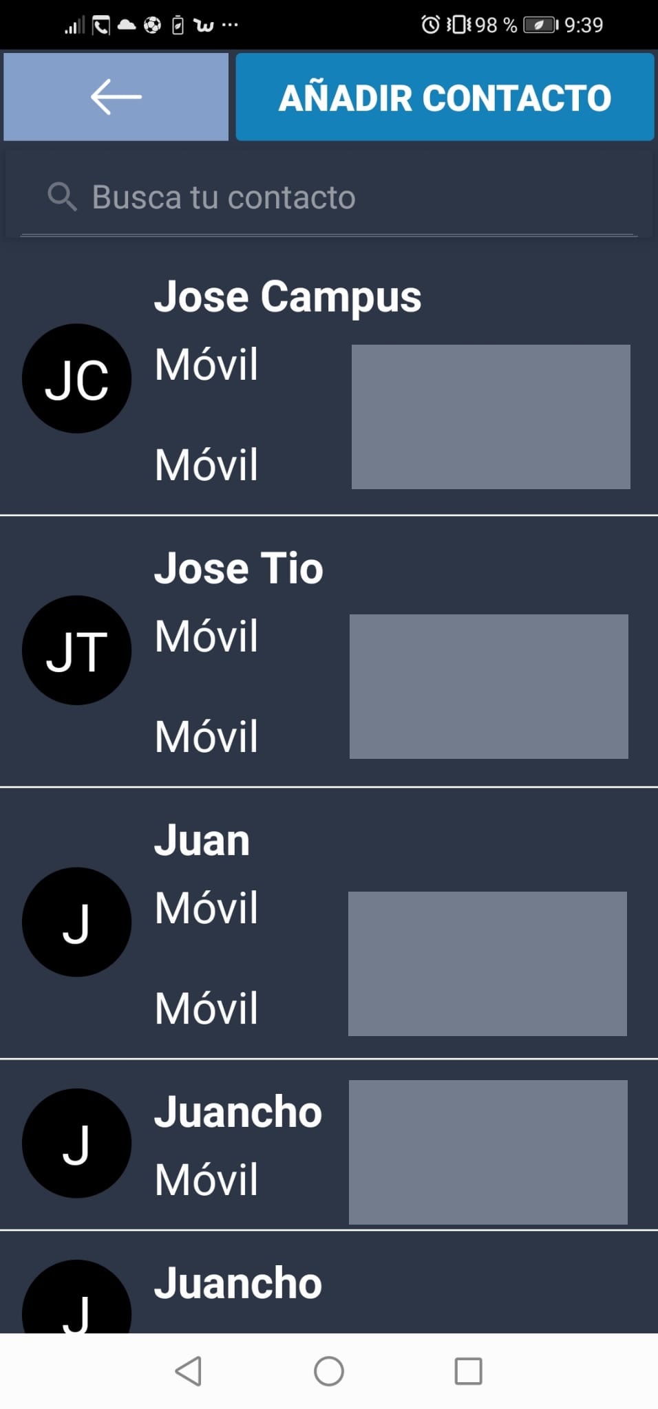
- A numeric keypad in case you want to call a contact that is not located in the main contacts. From the keyboard we can highlight the high contrast and large numbers, which allow the correct differentiation of these. Likewise, we can consult the call history and a contact list. Entering contacts in the agenda that has a search engine, which makes the search for the person we want to contact quite easy.


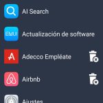
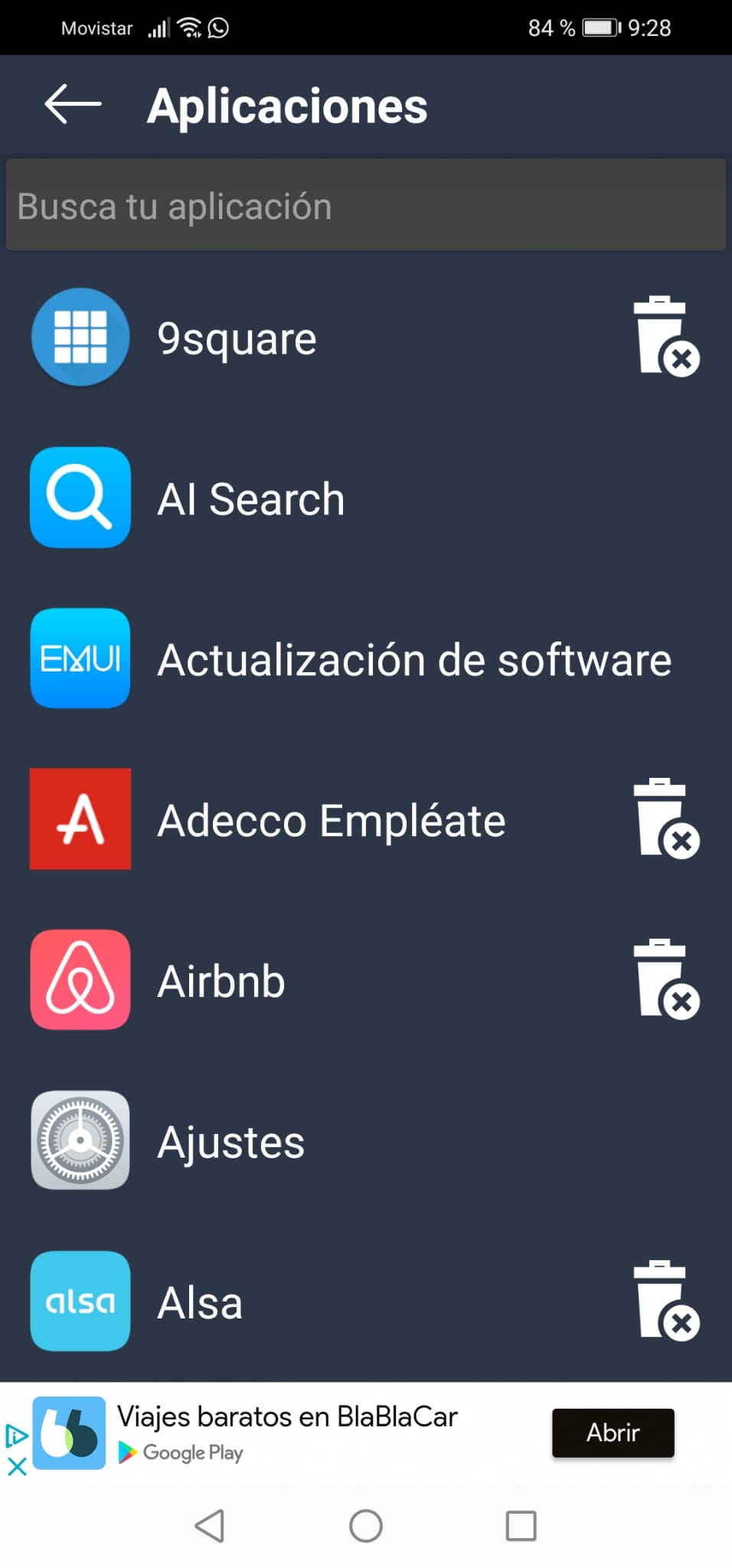
- An applications menu, where we can search for those that we have not placed on the main screen to access them, or even uninstall them just by touching the corresponding icon.

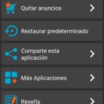
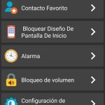
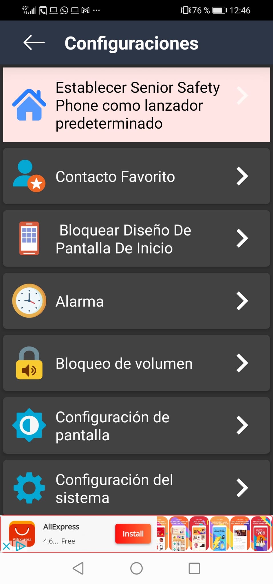
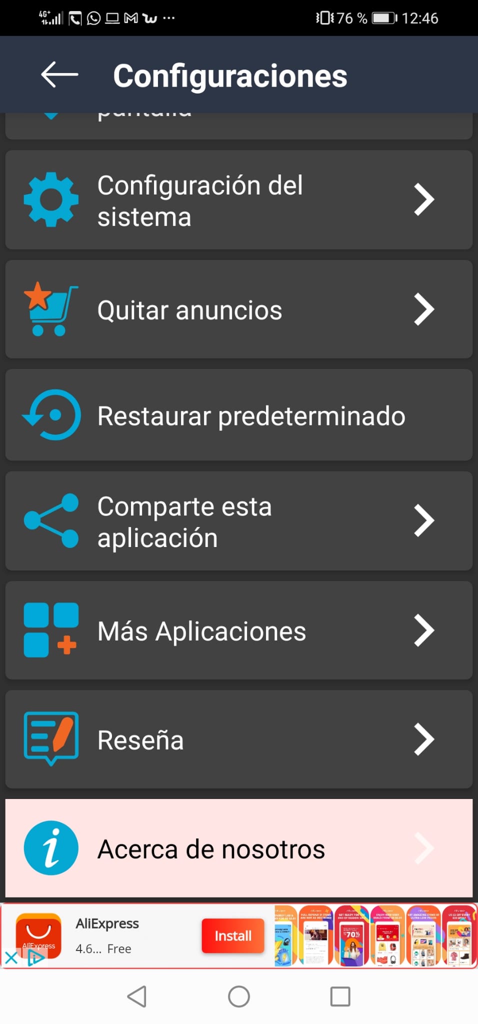
Having seen this, we can delve into the configuration part, where we find the following options:
– A means of accessing mobile messaging, that is, those messages of missed calls or company promotions.


From here we can highlight:
- The options related to the configuration of the phone are not made from the launcher itself, but they transfer you to the phone, so that if a size change is made in the font, it will be reflected in the app as well.
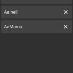
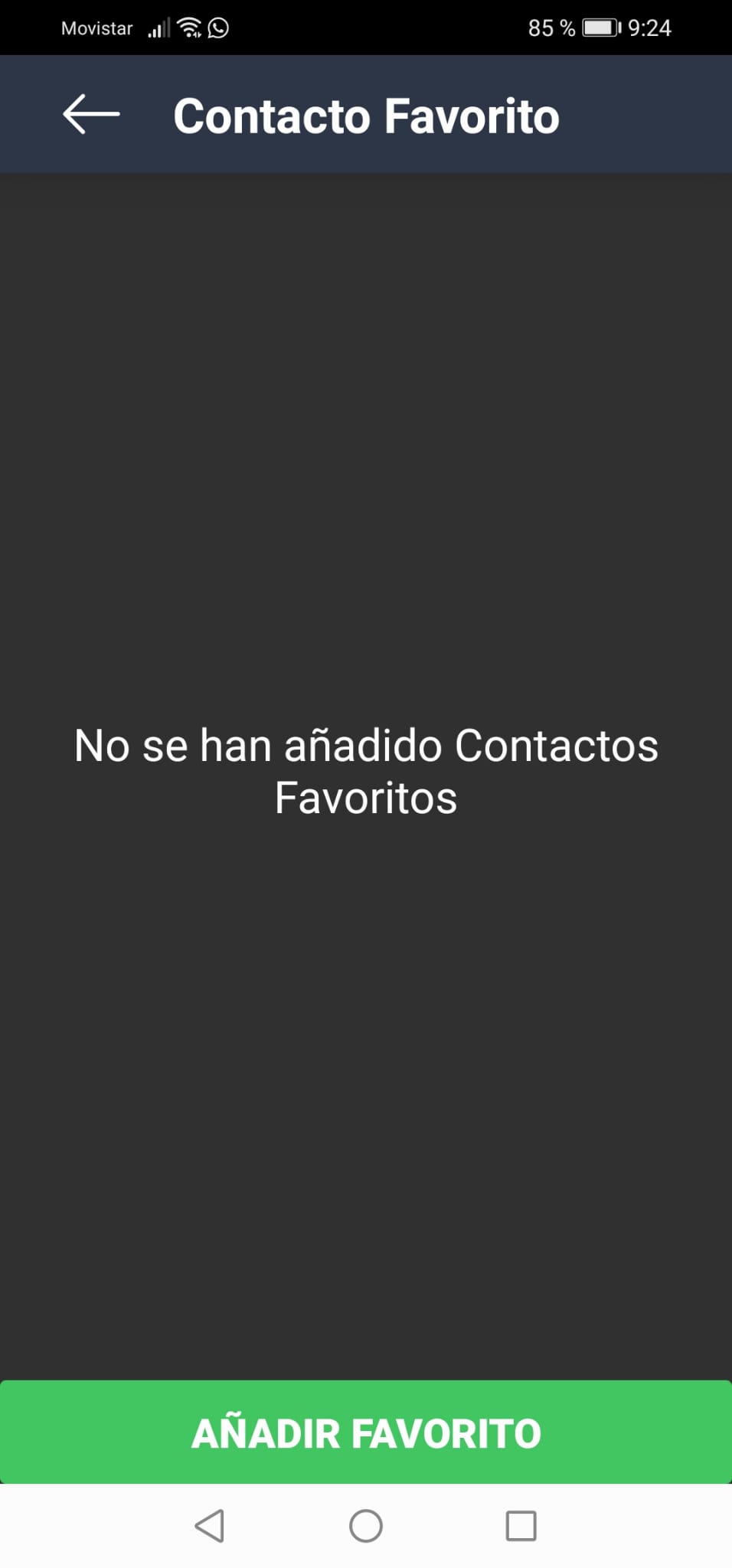
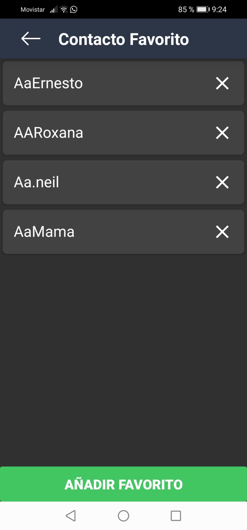
- Favorite contact: In this option we can establish those contacts with whom we interact the most, and which will appear on the main screen.


– Lock home screen design: allows us to choose which applications we want to see on the main screen, in the same way as previously mentioned.

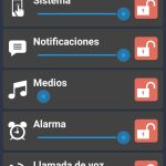
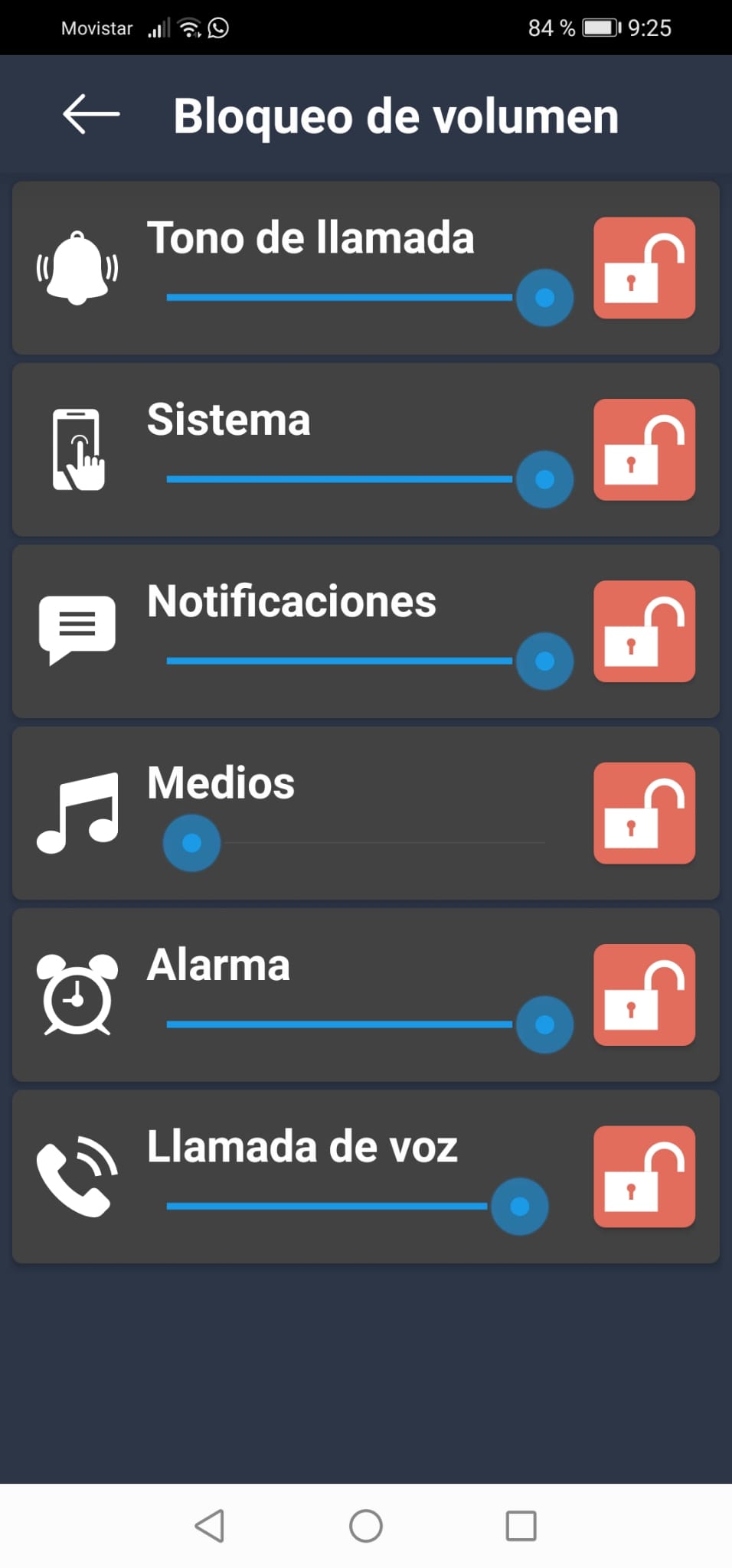
– Volume lock: allows us to adjust the volume of the device and block its modification to avoid unwanted changes.
- The icons are quite clear and adequately sized, as is the font. In this way, it facilitates the user with what modification options they have.

As we have seen in the previous points, in general terms, the application offers means to configure the environment to our needs, offering us sections to place our main contacts and the applications that we use the most.
This configuration can be done from the main screen, which makes using the app more comfortable, but also by entering the settings section, where we see various configuration options and even the possibility of returning to the default settings.
Finally, we emphasize that the size of the letters or icons notably facilitate the visualization of the contents and reduce the effort made by sight.
Accessibility.
After testing the application, we can say that it is aimed mainly at older people.
– The environment is easy to understand. Likewise, the app has the option to configure the main screen, allowing it to be conditioned to the corresponding needs.
– It has some sizes, both of icons and letters, quite visible by default, however, if needed, they can be modified through the settings. Likewise, high-contrast words and numbers are remarkable, which also facilitate visibility.
– Although it is mainly geared towards the elderly, it is possible to use Talkback, so the app can also become an option for the visually impaired.
Conclusion.
The application is a good option for certain needs since:
– Allows you to configure the main screen, facilitating access to important contacts and the most used applications.
– It has a simple interface that allows, for example, the search for device applications by name, as well as installing or uninstalling these applications without having to enter the device settings.
– It has an acceptable font size that can be modified according to our needs.
– It is possible to combine the use of the application with the TalkBack service, which allows blind people or people with reduced visibility to use the app.
Highlights.
– The use of the app does not become burdensome or difficult to understand, since thanks to the simplicity of the interface the environment becomes intuitive.
– It is possible to condition the main screen to what we need, being able to modify the sizes of the letters or icons and allowing us to order our important contacts and the most relevant apps for us.
– The detail of white words or numbers on a dark background allows us to clearly identify the options available to us.
– It is interesting the option of being able to uninstall an app without having to access the settings and simply pressing the button with the shape of a garbage container.
Improvement points.
– It incorporates other important applications such as Call For Help, but they can only be accessed if they are downloaded from the Play Store, thus increasing the use of the device.
– In some cases, when accessing the application search, the Senior Safety Phone was closed making it impossible to configure the device.
– There are some unlabeled buttons when using Talkback, which can hinder the experience since the user does not know what functionalities these buttons may correspond to.
